Has your organization recently completed a strategic planning process and created a “plan” that is nothing more than a glorified (and long) laundry list? Do you create annual plans full of aspirational goals that never quite get fully operationalized or implemented because no one knows where to start? Did you get a list of feedback from a funder or accreditor that you don’t know how to prioritize and tackle? I see many nonprofits struggle to make sense of “plans” – strategic, annual, compliance, corrective action, etc. – that aren’t really plans but are instead long lists of tasks that aren’t prioritized or organized in a cohesive way. In each of these cases, I’ve seen one simple tool from the world of Continuous Quality Improvement make sense out of the mess.
Relations Diagram
A relations diagram (also known as an interrelationship diagram) simply maps the cause-and-effect relationships between components of complex issues or plans, so it becomes clear which factors are the most influential. This helps teams prioritize and sequence their work.
Though our plans are often neatly segmented into groups of tasks by department or committee, for example, they are often very interdependent. If organizations don’t recognize those relationships, they set themselves up to waste time, energy, and resources (which we all know I hate!). When our departments and committees function in silos and don’t recognize how their initiatives and efforts influence and are influenced by those of other departments or committees, we end up working in circles!
A relations diagram helps a team see which factors in a complex issue (or “plan”) are the most independent and dependent variables. The independent variables are the one that are most likely to influence the others, to be at the root of an issue, to be upstream. If these are addressed first, they might change or altogether resolve other issues or initiatives that follow them. Dependent variables are the ones that are most susceptible to influence, most likely to be changed by something else in the system, and are best saved for last.
How To Make a Relations Diagram
- First, list all the components in your complex issue or plan. This might be a list of your strategic objectives from your strategic plan, a list of your goals from your annual plan, or a list of projects your department is working on, for example.
- Next, write each of those components in a circle. It’s best if you have no more than eight. Otherwise, it gets really messy.
- Then, starting at the top and moving clockwise (just so you don’t lose your place), draw arrows from that component to the others that it influences.
- Repeat that step till you’ve gone all the way around the circle. You’ll end up with what looks like a bowl of spaghetti.
- Lastly, for each factor in the circle, count the number of outgoing and incoming arrows it has and write the count of “Ins” and “Outs” next to each component.
- Now, you can analyze your diagram and see what it has to tell you. The factors with the most outgoing arrows are the ones that are the most influential, the most independent, the ones you might want to tackle first. The factors with the most incoming arrows are the most influenced, the most dependent, the ones you might want to save for last.
Let’s Try It Out
Let’s say an organization has six strategic objectives that it wants to address in the next two years:
- Enhance program evaluation strategies
- Improve program model to incorporate best practices
- Re-design its website
- Purchase, design, and implement a new database
- Upgrade its IT infrastructure
- Develop a new marketing campaign
Often, these initiatives would get assigned to their most obviously related departments (#1 and #2 to program, #3-5 to IT, and #6 to development) and then everyone would get to work in their silos. Somewhere along the way, they’d cross paths and realize that one depends on the other. Someone would have to backtrack, someone else would have to put their work on pause, and someone else would have to rush to catch up. I’ve seen it happen.
Let’s see what a relations diagram can show us. Let’s say I get people in the room from each relevant department, and we start exploring relationships. We realize that we can’t design our new evaluation strategies until we know how the programs might change. So we need an arrow going from box 2 to box 1. We know that we can’t pick a new database until we know what we want to evaluate, so we draw an arrow from box 1 to box 4. We can’t develop a new marketing campaign until we know what we’re marketing, and that’s a combination of what we do and the impact it makes. Therefore, we need arrows from boxes 1 and 2 going into box 6. And so on . . .
And this is what we end up with:
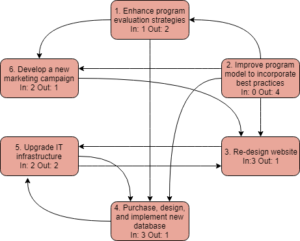
When we count our “Ins” and “Outs,” we learn that the project that’s most independent, most upstream is program improvement, because it influences four other projects and is influenced by none. We learn that the IT projects (#3-5) all have reciprocal relationships with each other, so they probably need to be decided and managed together. It looks like the database project (#4) is the most dependent, so we should save it for last.
The Bottom Line
Don’t waste time and energy working at cross-purposes or out of sync. Understand the relationships between your projects, initiatives, or goals, so you can tackle them in a smart and collaborative way!